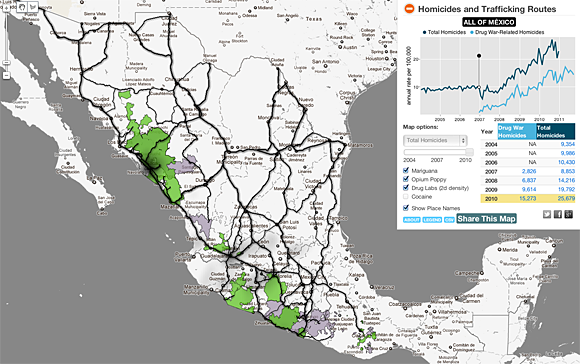
Diego Valle-Jones has created a powerful interactive map of the ongoing drug war in Mexico.
The interactive map lets you compare homicides and drug-related homicides, with the option to examine marijuana, opium, and drug-lab-related homicides. If you click on a bubble, you can see the number of murders over time, dating back to 2004. Important events are highlighted on that time line. You can also draw a shape on the map to look at a particular region.

Click to see the full interactive version of “Map of the Drug War in Mexico.”
Valle-Jones writes:
“To unclutter the map and following the lead of the paper Trafficking Networks and the Mexican Drug War by Melissa Dell, I decided to only show the optimal highways (according to my own data and Google Directions) to reach the US border ports from the municipalities with the highest drug plant eradication between 1994 and 2003 and the highest 2d density estimate of drug labs based on newspaper reports of seizures. The map is a work in progress and is still missing the cocaine routes, but hopefully I’ll be able to add them shortly.”
The data can be exported to CSV, and the source code is available on Github.
Found a great visualization? Tell us about it
This post is part of an ongoing series exploring visualizations. We’re always looking for leads, so please drop a line if there’s a visualization you think we should know about.
 Strata 2012— The 2012 Strata Conference, being held Feb. 28-March 1 in Santa Clara, Calif., will offer three full days of hands-on data training and information-rich sessions. Strata brings together the people, tools, and technologies you need to make data work.Save 20% on registration with the code RADAR20
More Visualizations:
- Politicians’ word counts
- Visualizing SOPA tweets
- Visualizing your friends’ Facebook likes
- AntiMap lets users capture and visualize their movements
- Mapping traffic casualties
- More Visualizations of the Week